An icon reimagined
Branding | Packaging | Illustration
Lea & Perrins Worcestershire sauce is a true icon and beloved worldwide. However, its packaging has remained largely unchanged for decades – aging the brand and making it less attractive to younger audiences. It needs a refresh to truly represent the punch it packs in contemporary cooking.
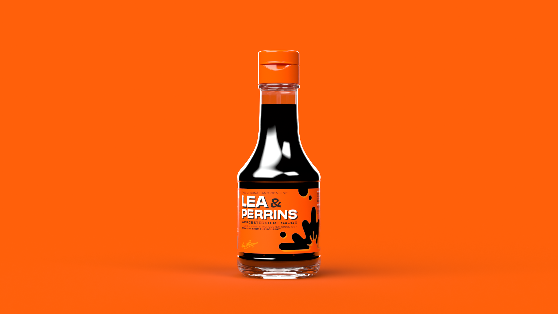
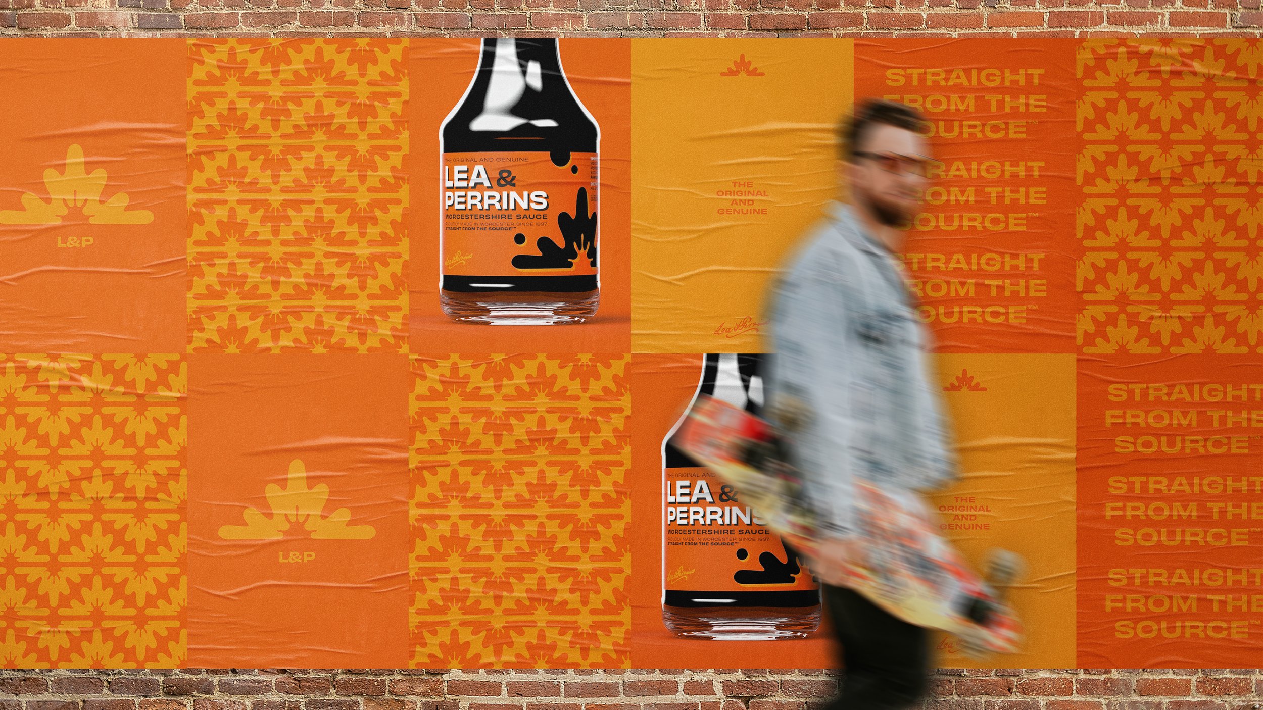
Straight from the source
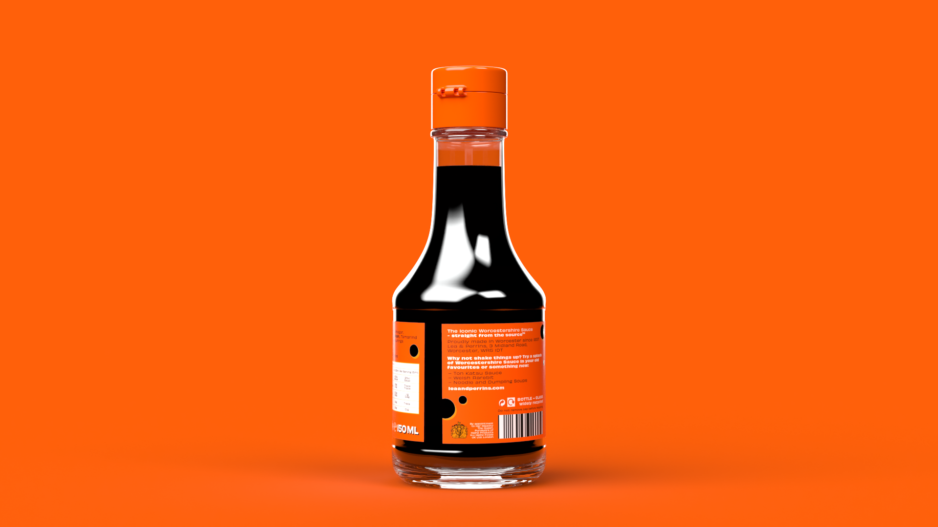
Retaining but elevating the heritage of such a product was key. The new identity centres around the ‘Sauce Splash’ – present for decades on the previous three label iterations and representative of the flavour explosion Lea & Perrins can add to any dish. And the label itself... orange of course (what else!?)

Causing a splash
A contemporary bottle with a wider base mimics the barrels that the sauce is aged in, to help it stand out from the copycats. The premium die-cut label, wider stance and brand-orange cap demand attention and communicate the brand’s impressive status.